
Colour theory in a nutshell
Mixing colors
To appreciate how light and colour interact, we first need to understand the basic scientific principles on which this depends. The first important point is colour mixing. The primary colours are red, green and blue – just as we learned in school. The more of each colour we mix together, the darker that the resulting mixed colours will be. If all three primary colours are mixed in equal proportions, we get black. This kind of colour mixing is known as subtractive, and can be applied to all methods in which colour pigments are mixed together.
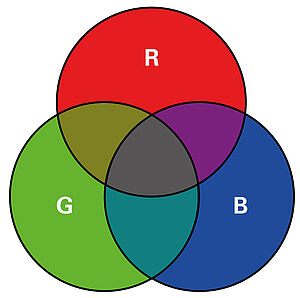
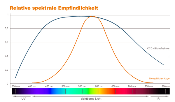
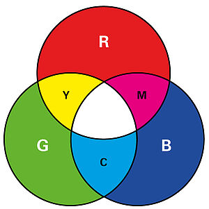
When we work with light, we refer instead to additive colour mixing. If we mix together red, green and blue light in equal proportions, we get white light. Red and green light in equal proportions without any blue light will produce yellow, while red plus blue makes magenta, and blue plus green makes cyan. We need this knowledge in order to understand how coloured bodies interact with coloured light. White light is therefore composed of a mixture of the three wavelengths red, green and blue.
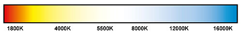
Accordingly, it logically follows that white light cannot be given a wavelength itself. Instead, the classification of white light relies on the colour temperature. This is specified in Kelvin and corresponds to the temperature of a black body, or black-body radiator*. The black body perfectly absorbs all lectromagnetic radiation. If it is heated, however, it begins to glow and therefore produce light in the visible spectrum. The temperature at which this occurs is the colour temperature.
Light and colour
We now want to bring these concepts together and relate them to the topic of image processing. Especially in the case of image processing tasks involving coloured objects and backgrounds, choosing the right wavelength is an important aspect. Particularly when using monochrome cameras, use of the right light colour can achieve effects that decisively improve solutions to many Machine Vision applications.
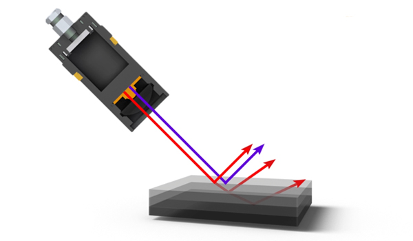
Contrast is significantly improved in the object image without additional optical or software filters being needed. This considerably simplifies the image processing task. The principle itself is very simple: an object reflects certain wavelengths and therefore appears coloured to the human eye. An object that we perceive as red therefore reflects the red portion of the light. Other wavelengths are instead absorbed. Conversely, this means that lighting a red test object with red light will make the object bright in the image. If we illuminate it instead with a wavelength containing no red portion, the light will be absorbed and the object will appear dark.
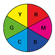
If we take a second look at the colour wheel, this effect can easily be transferred for use on other colours and wavelengths. If a yellow object is irradiated with blue lighting, it appears black. When lit with red or green light, it reflects the red or green colour portions of the light. The object appears bright. Here, it is important to remember that white bodies reflect all wavelengths and black bodies absorb light most strongly. Accordingly, these bodies usually respond independently of the colour temperature.
The range of applications for coloured lighting is very broad indeed. Examples of its use include inspection of printing on products in the packaging industry, in the assembly of coloured plastic parts or for pick-and-place tasks involving coloured objects or backgrounds.
Light and colour – infrared
Special effects are encountered, however, when working with radiation outside the visible spectrum. In the long wave infrared range in particular, coloured and printed materials behaves differently than in the visible spectrum. Both the reflection and absorption of infrared radiation is more dependent on the material and surface properties than on the material colour. Accordingly, an identical material will reflect and absorb to the same degree, regardless of its colouration. If light falls on a printed surface, for example, then the actual print present on the surface can be made almost entirely invisible to the camera. All colours will reflect this radiation uniformly. A similar effect is seen with various coloured plastics, labels – and even with many types of thermal transfer printing.
Black and white areas are one exception here. For these, the ground rule continues to apply: black is the strongest absorber of all wavelengths, while white reflects all wavelengths equally. As a result, black and white objects still appear black and white in the image. This means that infrared lighting can be used in conjunction with coloured objects to selectively mask certain areas.

A practical example
In food packaging in particular, an appealing design is considered important, since it will encourage the consumer to buy the product. Accordingly, the design typically features an all-over, multi-coloured print. If a particular printed feature – such as the shelf life expiration date or a barcode – needs to be detected, this presents us with an image processing problem. This is where infrared lighting comes into play. Important markings such as the shelf life expiration date are often embossed or printed in black. If we exploit the effects of infrared radiation on colour, we can simply make a distracting background “fade away”. The overprint we need is brought into the foreground and can easily be analysed. Apart from its usefulness with coloured test objects, this is not the only place where longwave infrared radiation has an important role to play. Infrared lighting can also be used to look inside certain kinds of materials. This technique is used in inspections using backlight systems on conveyor belts, for example. Infrared radiation can also be used in combination with specialised filters to attenuate (block) extraneous light.